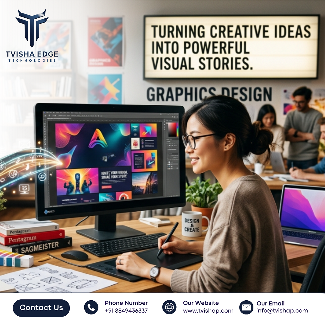
Design That Converts Ideas into Compelling Visual Stories
Strategic Graphic Design That Transforms Ideas into High-Impact Visual Stories by Tvisha Edge Technologies
Design That Converts Ideas into Compelling Visual Stories is becoming essential in modern industrial and business environments, where graphic design must do far more than simply look appealing. It plays a critical role in clear communication, minimizing confusion, and supporting faster decision-making across teams—whether on a factory floor, inside a warehouse, or within digital platforms. Effective Graphics design is not about decoration; it is about organizing and presenting information so people can quickly understand it and take action.
This blog explores practical, real-world principles that drive effective graphic design writing and visual communication—focusing on usability, clarity, and impact rather than just theoretical concepts.
1. Clarity Comes Before Creativity
One of the most common challenges in design projects is balancing visual appeal with clarity. In operational settings, clarity always takes priority.
For example, in manufacturing documentation, safety signage, or product interfaces, users don’t have time to interpret complex visuals. If a design forces the viewer to “figure it out,” it fails its purpose.
Practical approach:
- Use simple layouts with a clear hierarchy
- Limit the number of visual elements per section
- Ensure text is readable at a glance
- Avoid overuse of decorative elements that don’t add meaning
- Clarity reduces errors and improves usability—especially in high-pressure environments.
2. Visual Hierarchy Guides Attention
Visual hierarchy determines how information is consumed. In real-world applications, users scan before they read.
Designers must structure content so that the most important information is seen first, followed by supporting details.
Key techniques:
- Use size differences to emphasize importance
- Apply contrast to separate primary and secondary elements
- Group related information together
- Use spacing to create breathing room between sections
- A well-structured hierarchy helps users quickly locate critical information without cognitive overload.
3. Consistency Builds Trust
Consistency in design is often underestimated but plays a critical role in professional environments. Inconsistent fonts, colors, or layouts can create confusion and reduce credibility.
In industrial documentation or business branding, consistency ensures that users can predict how information is presented.
Practical implementation:
- Maintain a fixed color palette
- Use standardized typography across materials
- Apply uniform spacing and alignment rules
- Follow reusable design patterns for recurring content
- Consistency improves recognition and reduces the learning curve for users interacting with multiple materials.
4. Design Must Support Real Usage Conditions
Design is not always viewed under ideal conditions. It may be seen on mobile devices, printed materials, or in environments with poor lighting or distractions.
In warehouses, factories, or field operations, users may glance at visuals briefly while multitasking.
Considerations:
- Ensure high contrast for readability
- Avoid overly detailed visuals that require zooming
- Design for different screen sizes and print formats
- Test designs in realistic usage scenarios
- Design that works in controlled environments may fail in practical use if these factors are ignored.
5. Communication Over Decoration
Every design element should serve a purpose. Adding visual elements without functional value often leads to clutter and reduces effectiveness.
In operational contexts, unnecessary visuals can slow down understanding or even lead to misinterpretation.
Guideline:
- Ask whether each element communicates something meaningful
- Remove anything that does not contribute to understanding
- Prioritize diagrams, icons, and layouts that explain rather than decorate
- Good design simplifies communication instead of complicating it.
6. Iteration Based on Feedback
Effective design evolves through feedback from actual users. Internal assumptions do not always match real-world behavior.
In industrial and business environments, feedback from operators, engineers, or end-users is essential to refine visuals.
Approach:
- Share prototypes early
- Collect feedback from actual users, not just stakeholders
- Observe how people interact with the design
- Make iterative improvements based on usage patterns
- This reduces rework and ensures the final output aligns with practical needs.
Conclusion:
Graphic design is most effective when it functions as a communication tool rather than just a visual asset. In real-world industrial and business contexts, design must be clear, consistent, and practical. It should help users understand information quickly, reduce errors, and support workflows without unnecessary complexity.
Design that converts ideas into compelling visual stories is not about adding more elements—it is about removing friction from understanding.  Learn more about our work: https://tvishap.com/
FAQs
Q1: What is the most important principle in graphic design for industrial use?
- Clarity is the most important principle. Designs should communicate information quickly without requiring explanation.
Q2: How does visual hierarchy improve design effectiveness?
- It guides the viewer’s attention, ensuring they see the most important information first, followed by supporting details.
Q3: Why is consistency important in design systems?
- Consistency builds familiarity, reduces confusion, and strengthens trust in the communication.
Q4: How can designers ensure their work performs in real-world conditions?
- By testing designs in actual environments, considering lighting, screen sizes, and user behavior.
Q5: What role does feedback play in design improvement?
- Feedback helps identify usability issues and ensures the design aligns with how people actually use the content.
#GraphicDesign #VisualCommunication #DesignPrinciples #UXDesign #IndustrialDesign #DesignThinking #VisualHierarchy #DesignConsistency #UserExperience #TvishaEdgeTechnologies


Comments
Post a Comment